Here’s one from the brand graveyard. This wasn’t the final brand mark chosen for seedling digital, but it’s still worth a share.
Earth (solid foundation) + seed (an idea / business) + water (nourishment) = a seedling (growth).
This reflects the mission of Seedling Digital – to help small businesses make big growth!
Logos come together through many stages:
– discussions with business owners about their unique offer and points of difference;
– competitor and target market research;
– sketching, reflection, refinement;
– vector design using illustrator; and
– client presentation and amends (if required).
Following this process with Seedling Digital means:
The final brand is unique to each business and fits their values, vibe and offering.
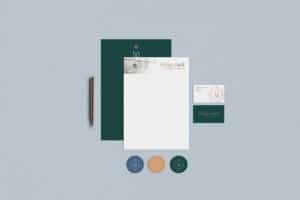
The final logo or suite of brand marks are high quality. Files are delivered in a range of colours and file types, so logos can be resized to be used for any purpose without appearing pixelated.
Along with logo design we also take into consideration colour theory, and typography selection to ensure the entire brand reflects the values, vision and vibe of a business while also connecting with their target market.
If you’re not happy with your current brand, please get in touch to find out more about how we can help your business level up your visual game.