feel
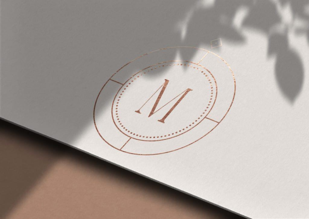
The concept of True North within business is used to represent growth and the quest for the ideal state.
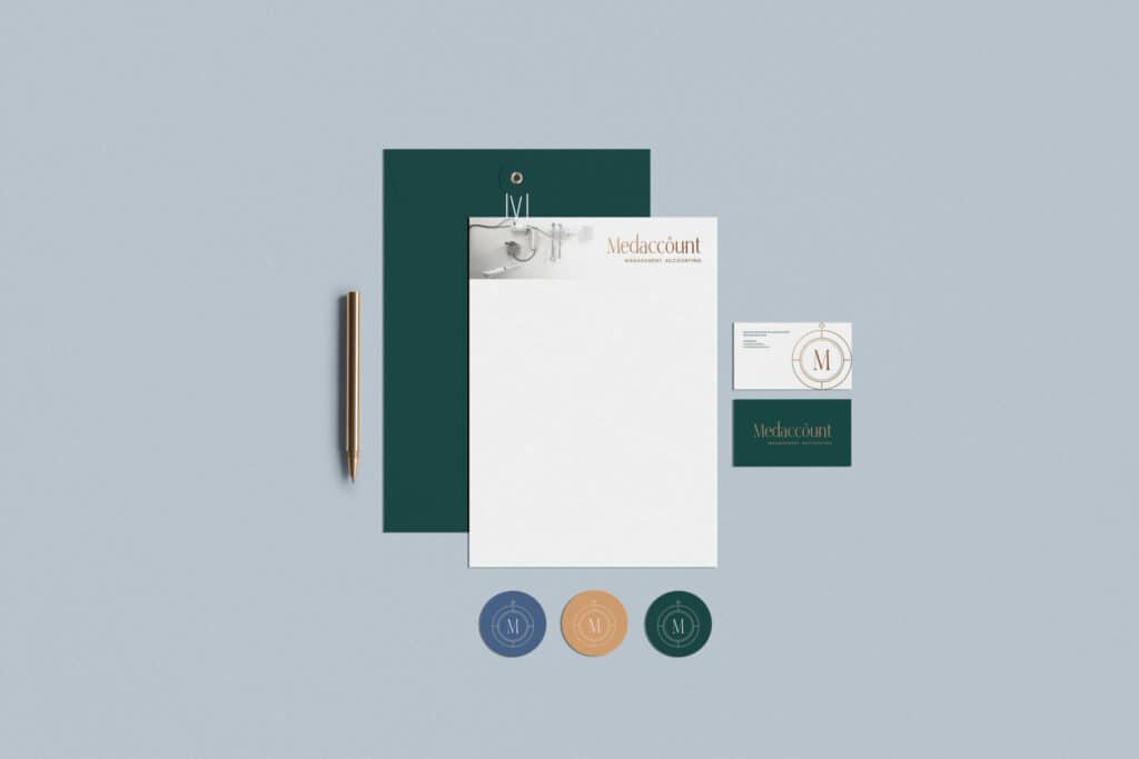
The Medaccount brand leans on this idea, using a stylised compass icon both in the the primary logo (lettermark) and the brand mark.
features
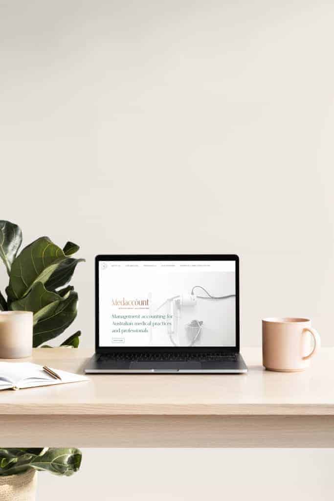
The Medaccount brand has been designed to represent the direction provided to Medaccount clients through the expert financial service and advice of Siobhan Lyons.
Typography is a twist on the classic serif, while color palletes are luxe and rich. The result is a timeless, strong brand reminiscient of high end fashion brands. This differentiation will set Medaccount apart within the financial services industry.
feedback
“They look great thank you so much!! You have done such a great job!!!”
– SIOBHAN LYONS
