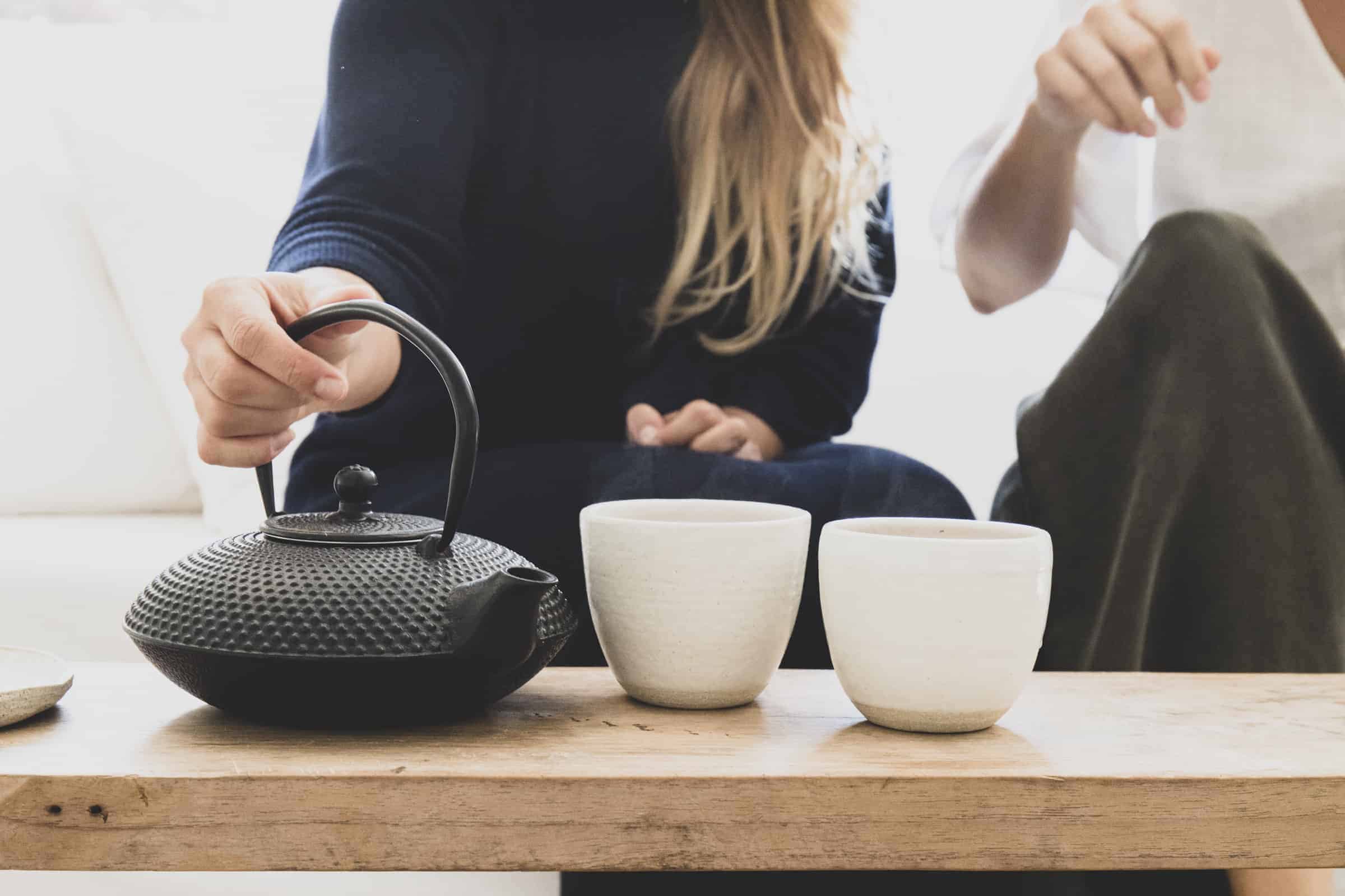

feel
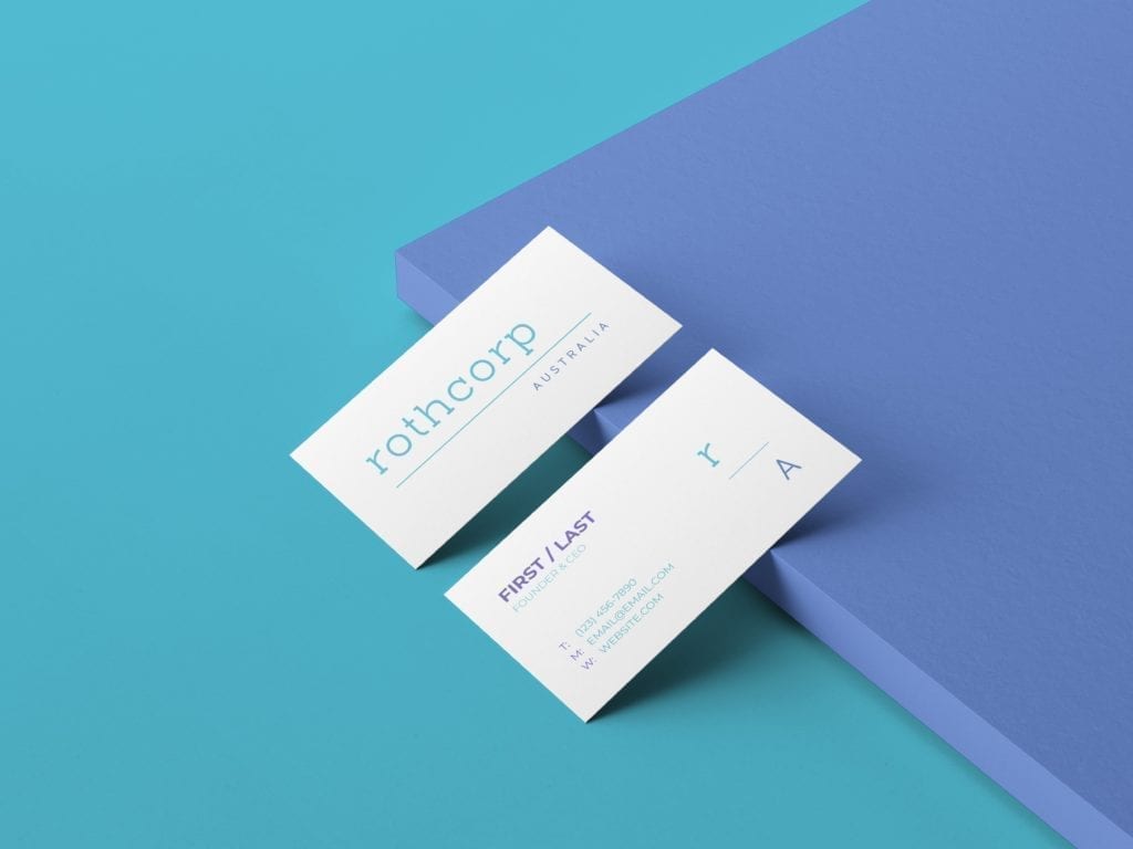
This client is a corporation, but as part of the brief the owners said ‘have some fun, be creative’. The result was a type-based logo, with enough structure to feel corporate, but enough colour to be different. I love the result, and so did the client!
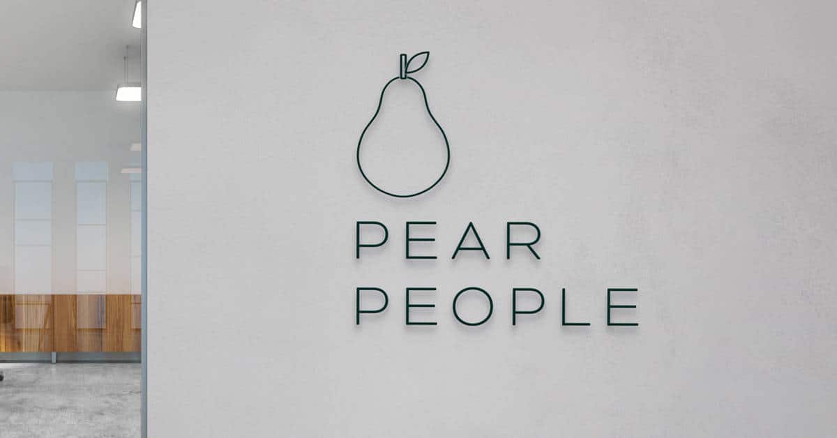
features
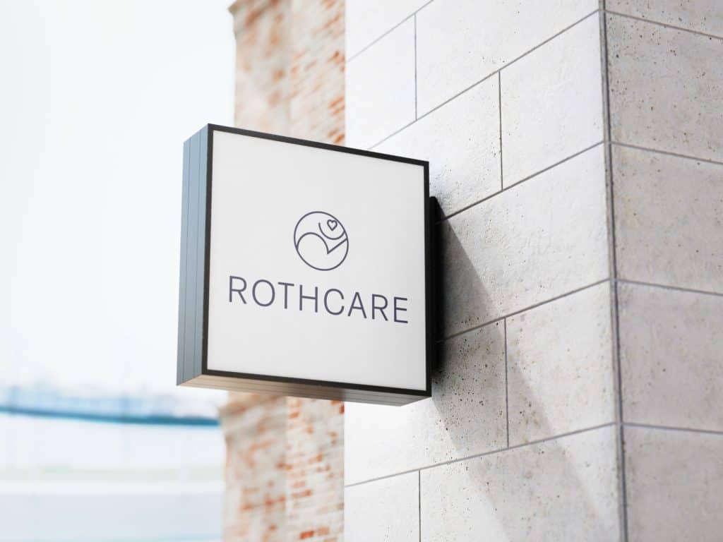
A stylised R + C have been flipped, and a heart added to form a brand symbol with dual meanings.
Firstly the R resembles a mountain, with a person standing atop. This represents the challenges that their products help users to overcome. Secondly, the entire mark resembles a person leaping, a daring expression of joy. This represents the products they provide. Products that enhance mobility and accessibility for their clients.
feedback
“Seedling digital provided the complete business package – logo’s, style guides, web upgrades and updates…… Nic was very professional to work with while being flexible and accommodating to our requirements – thanks Nic!”
– YVONNE ROTHALL
Sign up to receive updates, resources and more.
© Seedling Digital 2022
Currumbin Waters, Gold Coast
10 free tools to grow your business
Here are the tools I recommend to every business owner to streamline their processes, and start their digital marketing journey.
By clicking ‘download’ you agree that we may contact you about our services in line with the terms set out in our privacy policy. You may opt out at any time.