feel
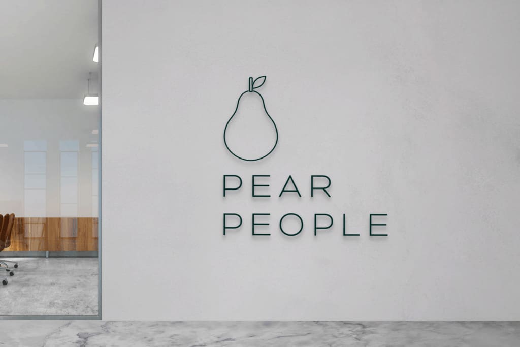
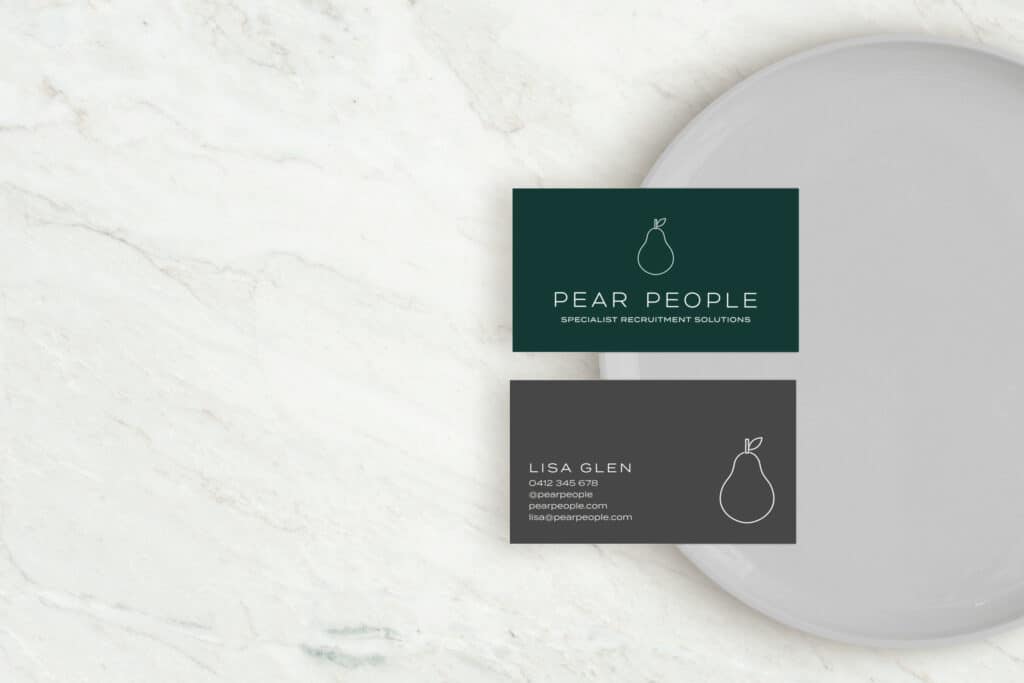
Colors are luxurious and deep, conveying a feeling of security and trust. Font choices add a clean, modern, minimalist feel to the brand, while an all caps treatment conveys authority in the field.
features
The Pear People brand has been inspired by the business mission, to place the best person in the right role.
They know that when the pieces fit, the companies, and the candidates they work with achieve great things.
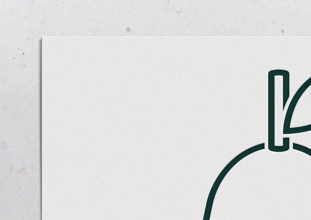
The separate pieces that make up the pear symbol all piece together perfectly. There is no overlap, each element making space to accommodate the other important components to create the perfect fit.
feedback
“Thanks again for all your efforts Nikki. We appreciate it greatly.”
– PENELOPE BOWLING
Sign up to receive updates, resources and more.
© Seedling Digital 2022
Currumbin Waters, Gold Coast
10 free tools to grow your business
Here are the tools I recommend to every business owner to streamline their processes, and start their digital marketing journey.
By clicking ‘download’ you agree that we may contact you about our services in line with the terms set out in our privacy policy. You may opt out at any time.