feel
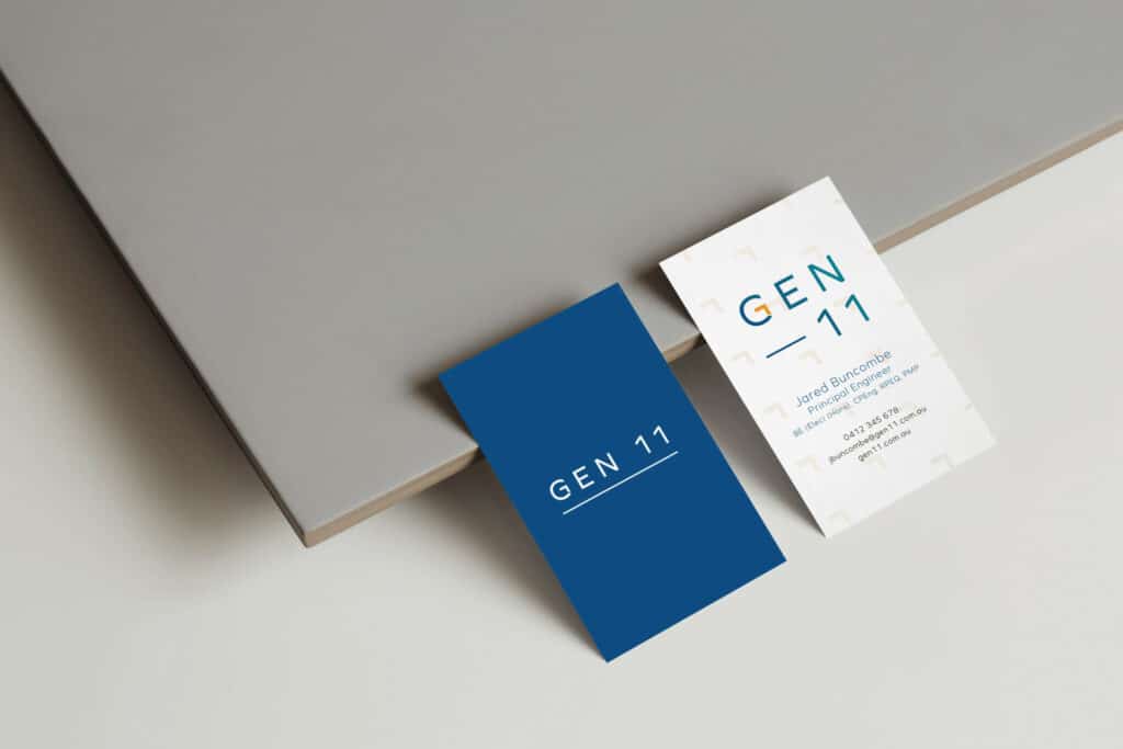
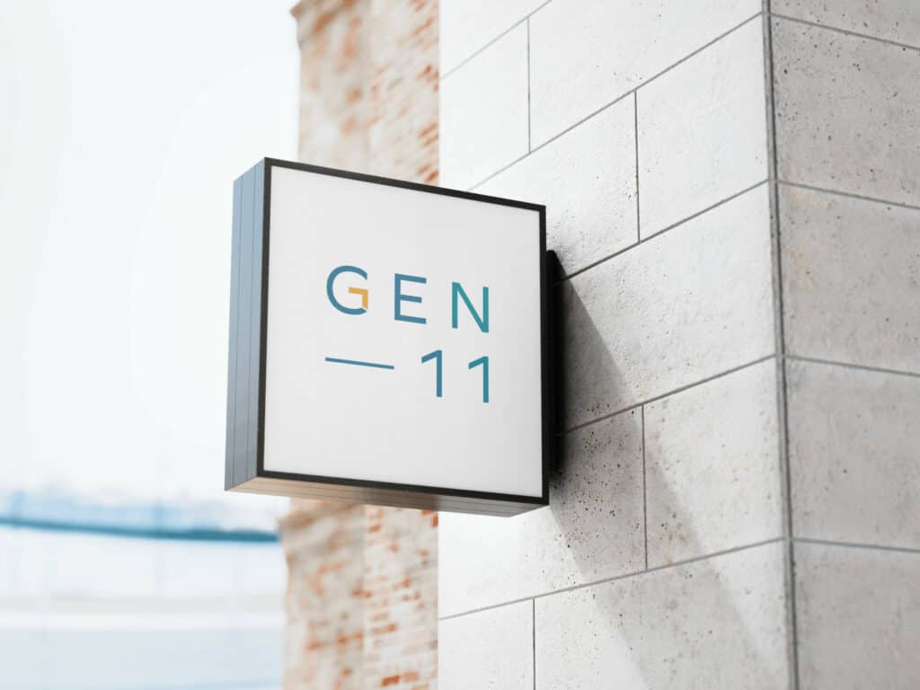
Branding for Gen11 relies on type modification to highlight a geometric shape within the letter G, representing both an arrow and a stylised triangle. Within construction, triangles are often used as support, to provide strength and stability to a structure.
When this strength and stability is in place, this allows a business to look toward the future and move forward with confidence.
A gradient is used through all logo lockups to achieve a modern feel.
features
Gen11 branding has been designed on the premise of foundational strength.
At it’s core, Gen11’s offers their clients a sense of confidence through ensuring the basics are covered, their obligations are met, and their risks are mitigated.
Modified type and geometric shapes are used to convey strength, while traditional corporate colours have been used to convey a sense of trust.
feedback
“Nikki was great to work with. She took on my vision and was able to turn it into branding that will last. Thanks Nikki!”
– JARED BUNCOMBE